
Cafeine Pushers
Caféine Pushers visual identity: an award-winning packaging design
The young Montreal-based company Caféine Pushers was born from an unlikely partnership: a fifty-something master in the art of blending coffee aromas and a highly-charged thirty-something sales expert. Both passionate about music, they wanted a concept that mirrored their contagious energy, offering an immersive, "trippy" experience where you can even scan a music track directly on the bag to get into the groove of your favorite blend.
To capture this unique essence, our agency designed the new Caféine Pushers visual identity. This project was also recognized for its avant-garde approach by an international jury at the 14th edition of the Grands Prix du Design. Through this design case study, explore our approach to food branding and the creation of this award-winning packaging design, conceived to reflect the brand's spirit and instantly catch the consumer's eye.
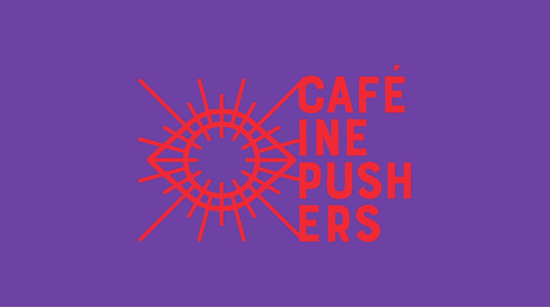


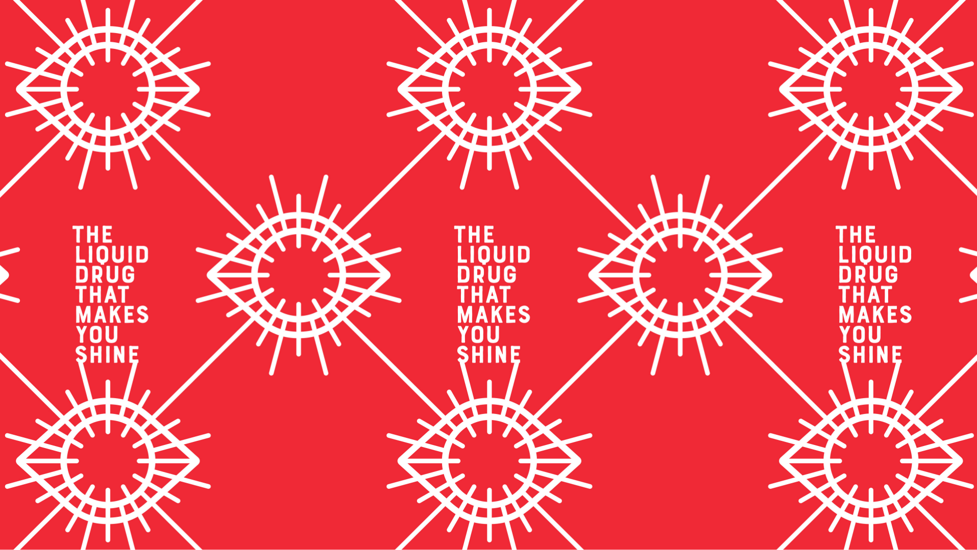
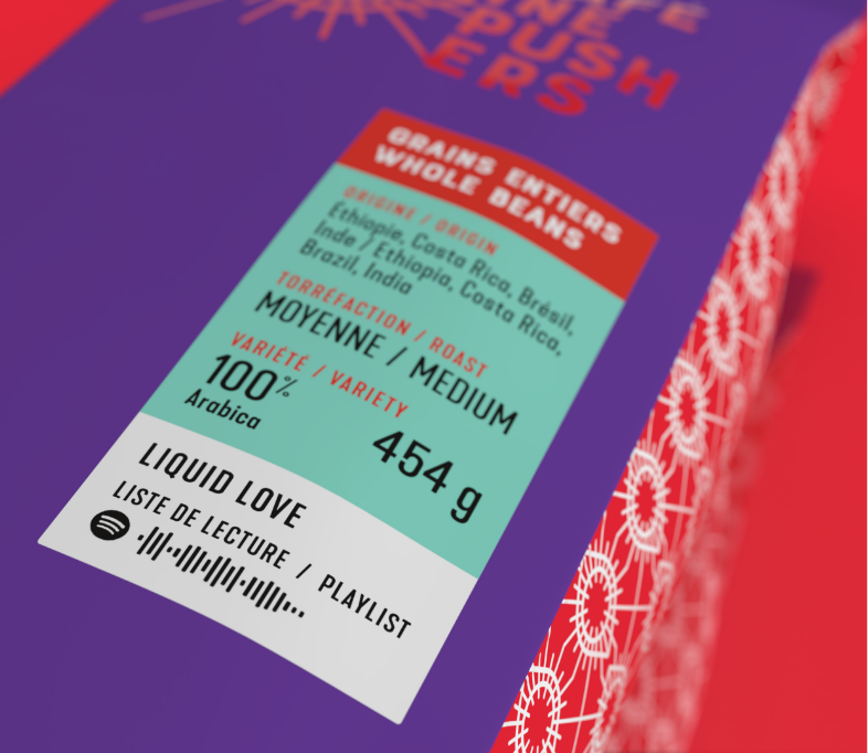
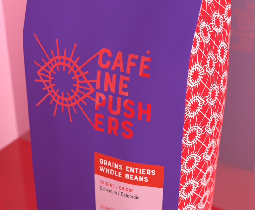
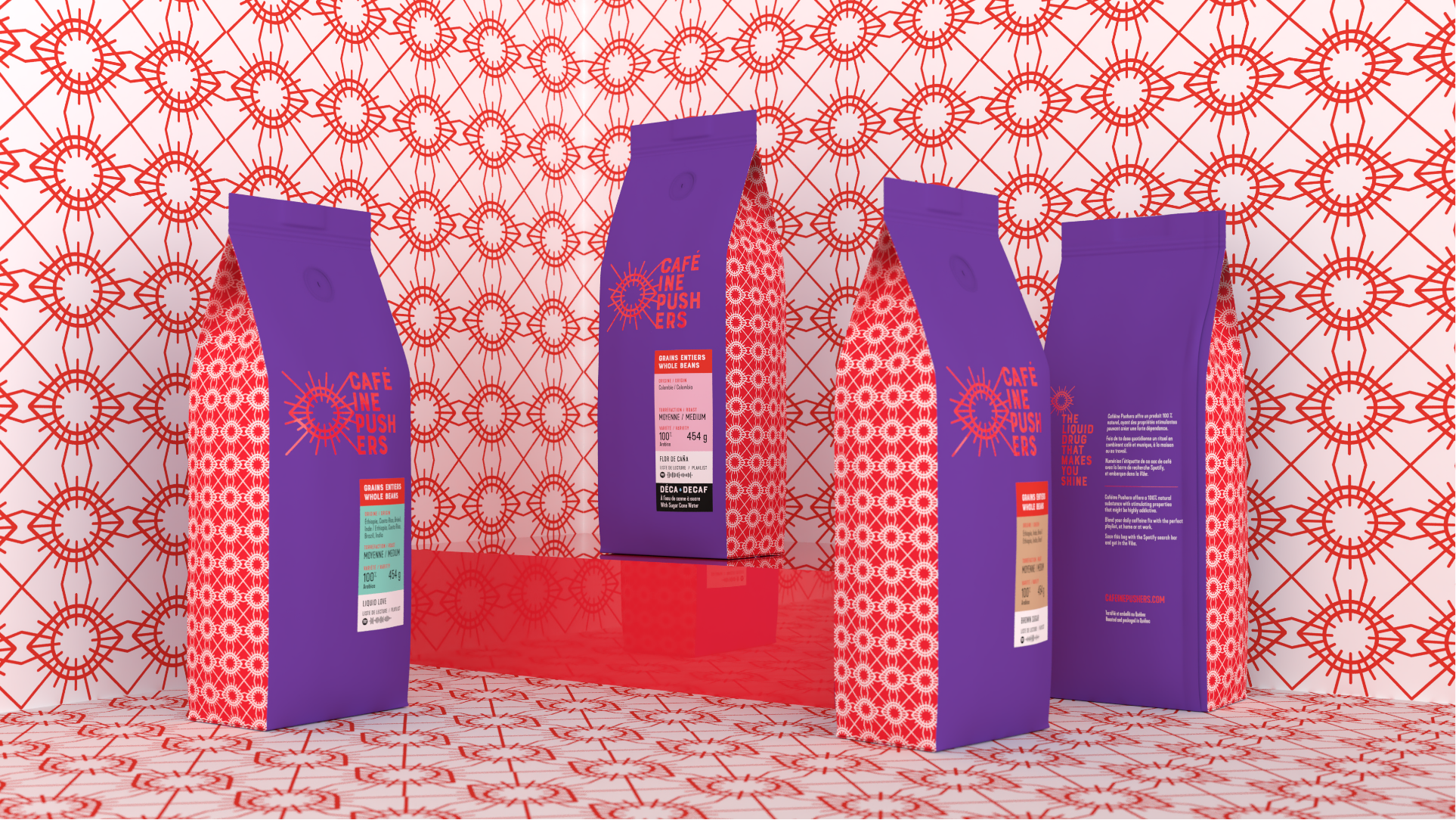
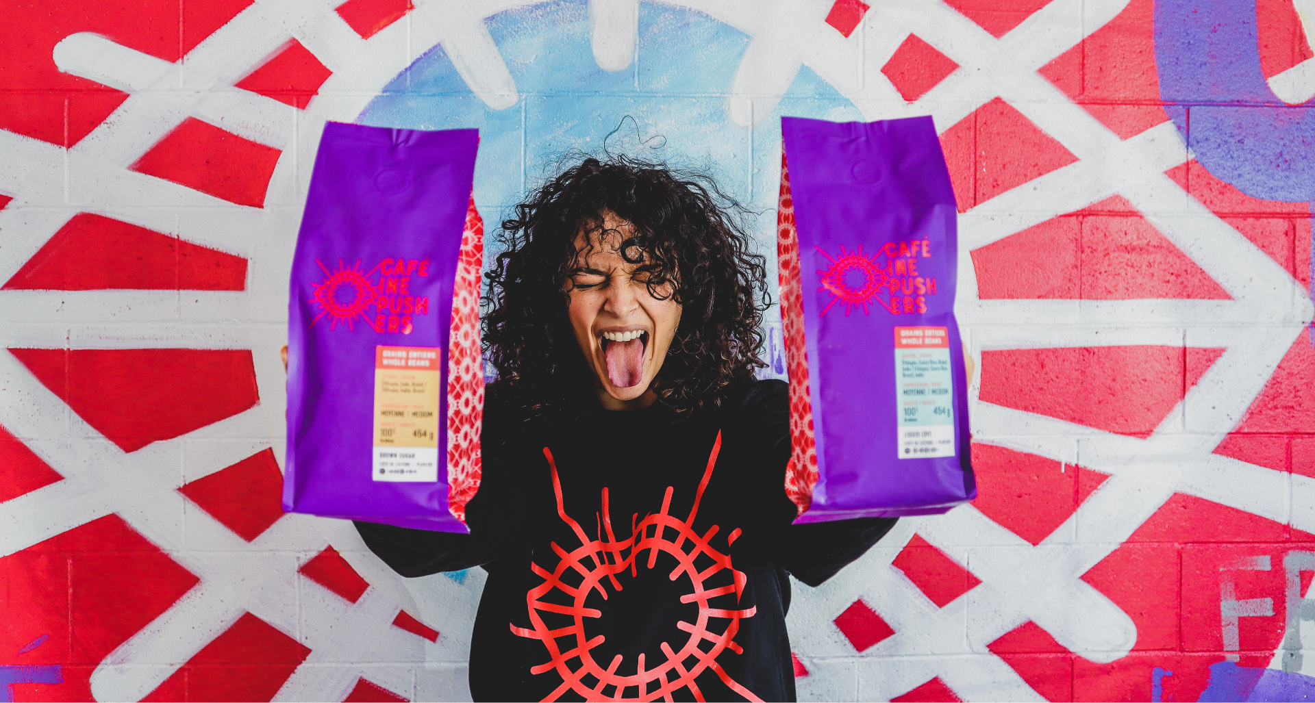
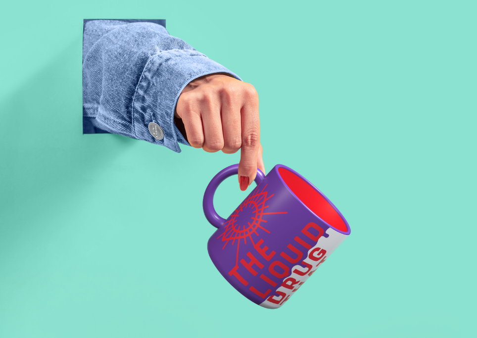
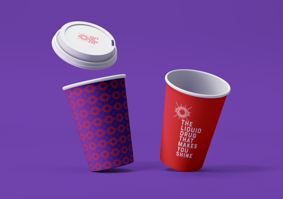
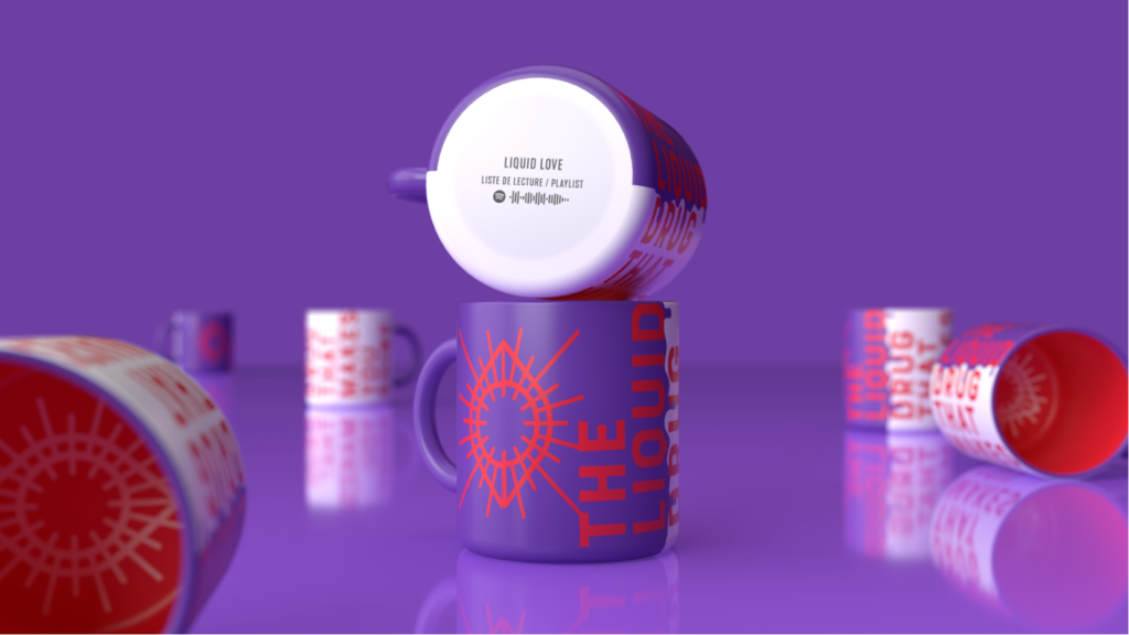
With its vivid, high-energy logo, our packaging design clearly conveys the idea that caffeine is the legal drug of choice for heightening your awareness. The use of an iconic eye, with its pupil dilated to the max and the flourish of red rays (think bloodshot eyes from fatigue, or the effects of illicit drugs) all combine to give the logo a provocative and highly distinctive appeal, with the overall brand identity artfully adapted throughout all packaging.
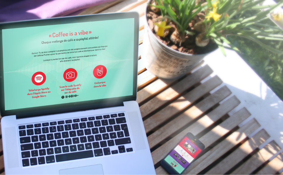
To incite greater daily consumption, each coffee blend is paired with a Spotify playlist curated by Caféine Pushers, featuring a code on the label driving consumers to new musical worlds crafted to help them reach nirvana.


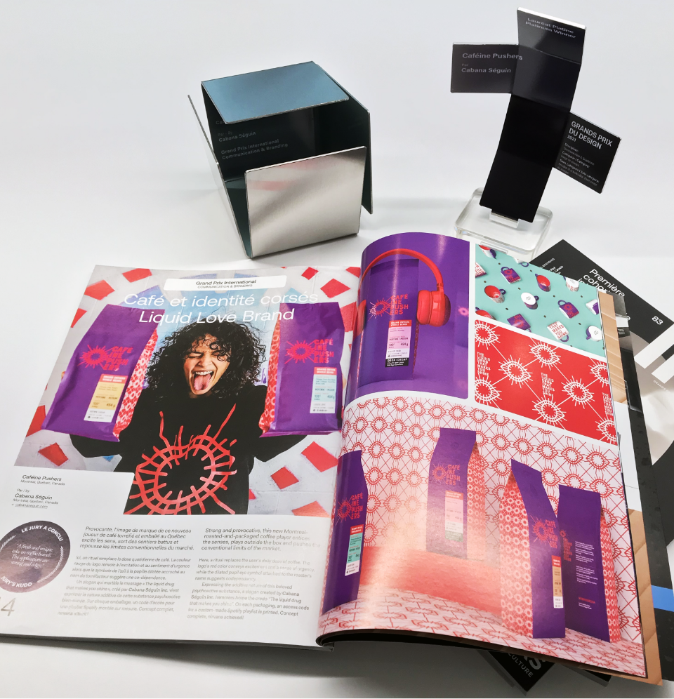
This project was recognized by an international jury for its edgy, avant-garde design during the 14th Annual Grands Prix du Design awards.
Category: Brand identity creation and logo design