
Parc Jean-Drapeau
Parc Jean-Drapeau visual identity: redefining a Montreal icon
Developed to host the 1967 World's Fair (Expo 67), Parc Jean-Drapeau has since been the stage for numerous historic events, including the 1976 Montreal Olympic Games and the Formula 1 Canadian Grand Prix. This island oasis is renowned for the diverse experiences it offers, blending nature, history, culture, and sports. Today, experiencing the Park is a matter of the heart—a naturally engaging experience for the citizens of Greater Montreal.
To honor this rich legacy, our agency was chosen to redesign the Parc Jean-Drapeau visual identity. Through this design case study, discover how we approached this major institutional branding mandate to build a brand ecosystem as vibrant and unifying as the park itself.
Services
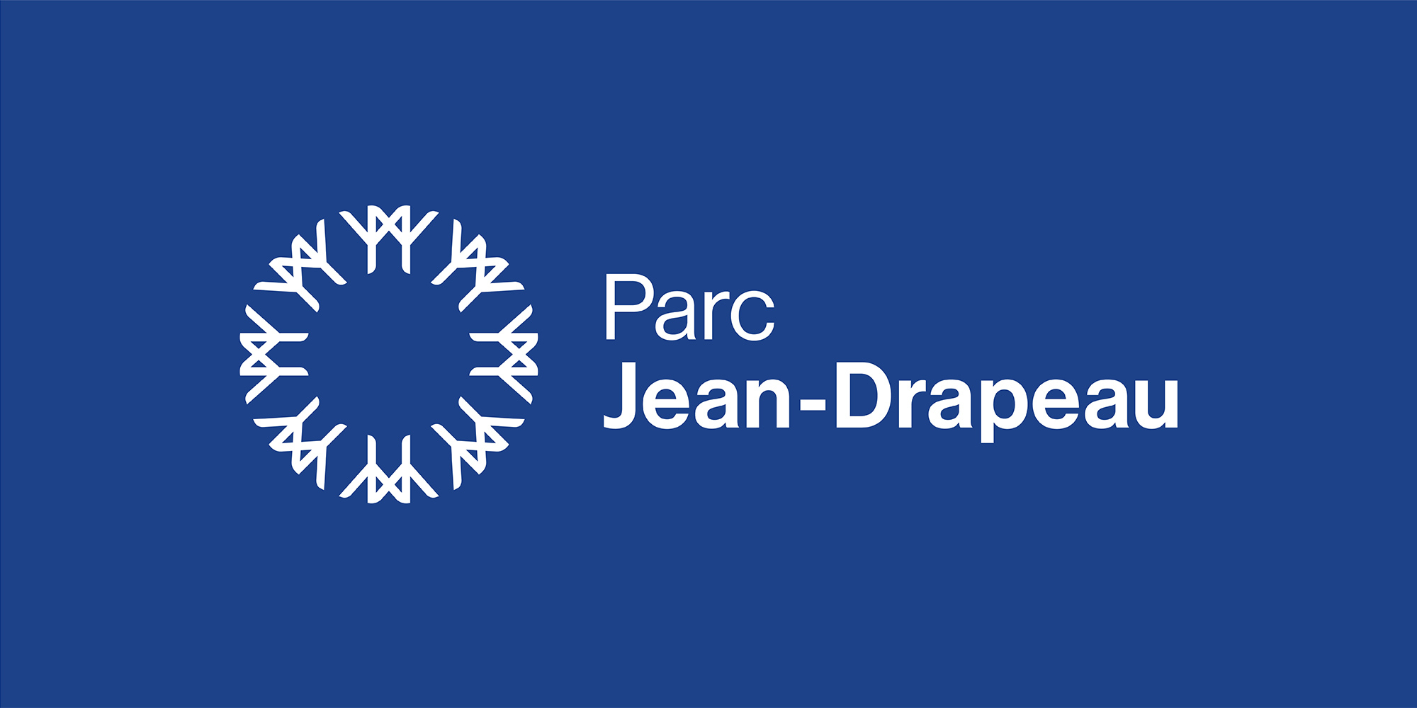
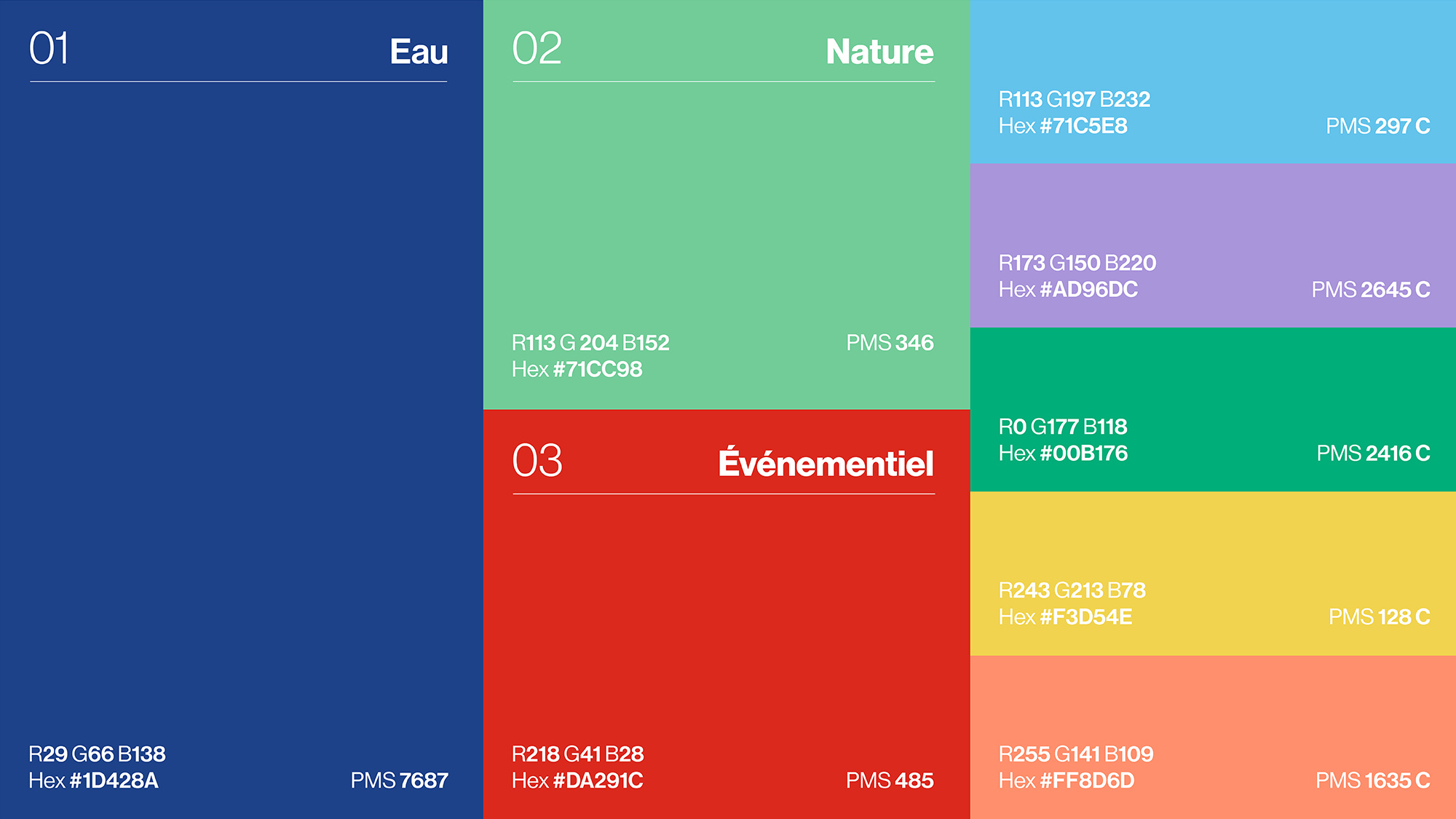
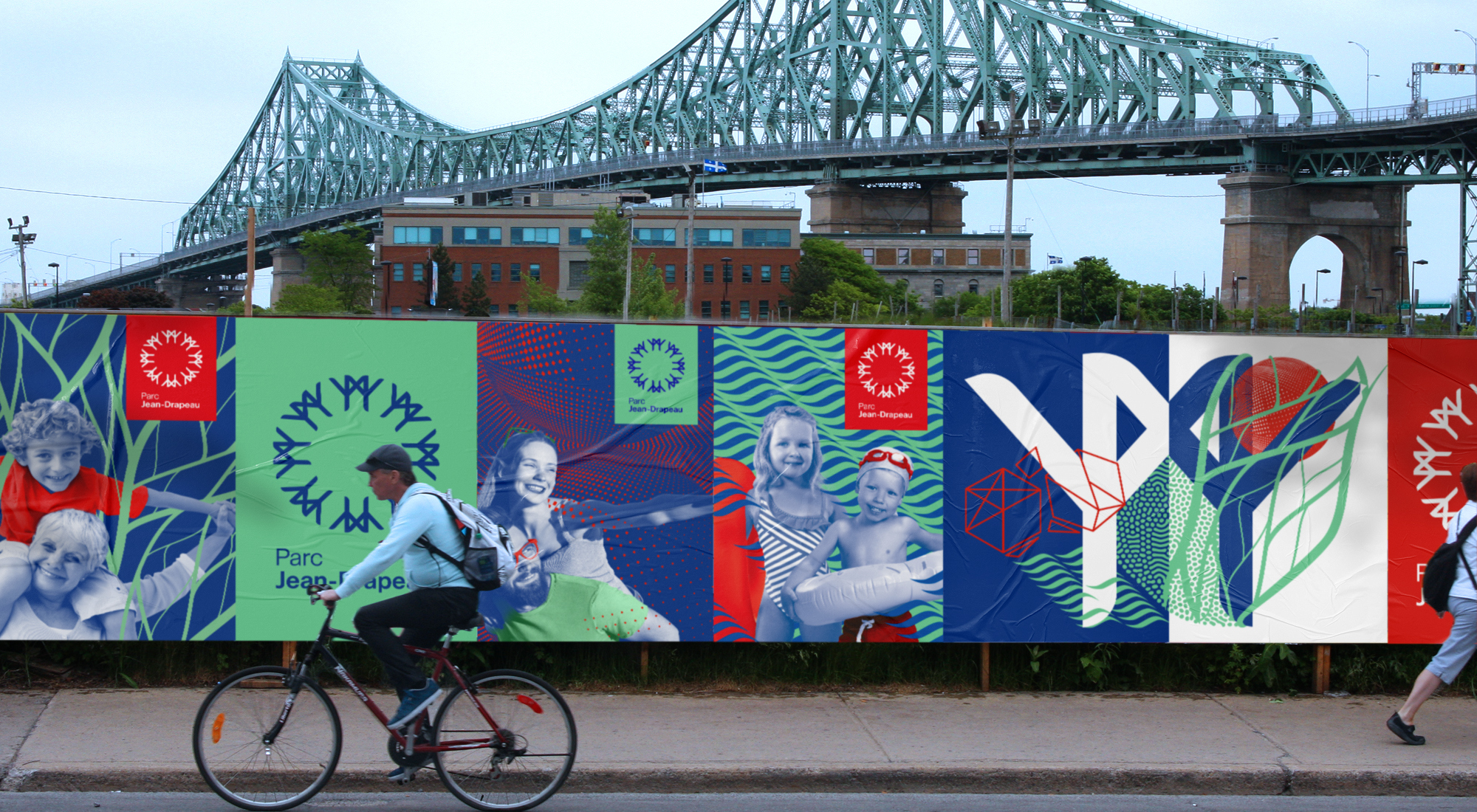
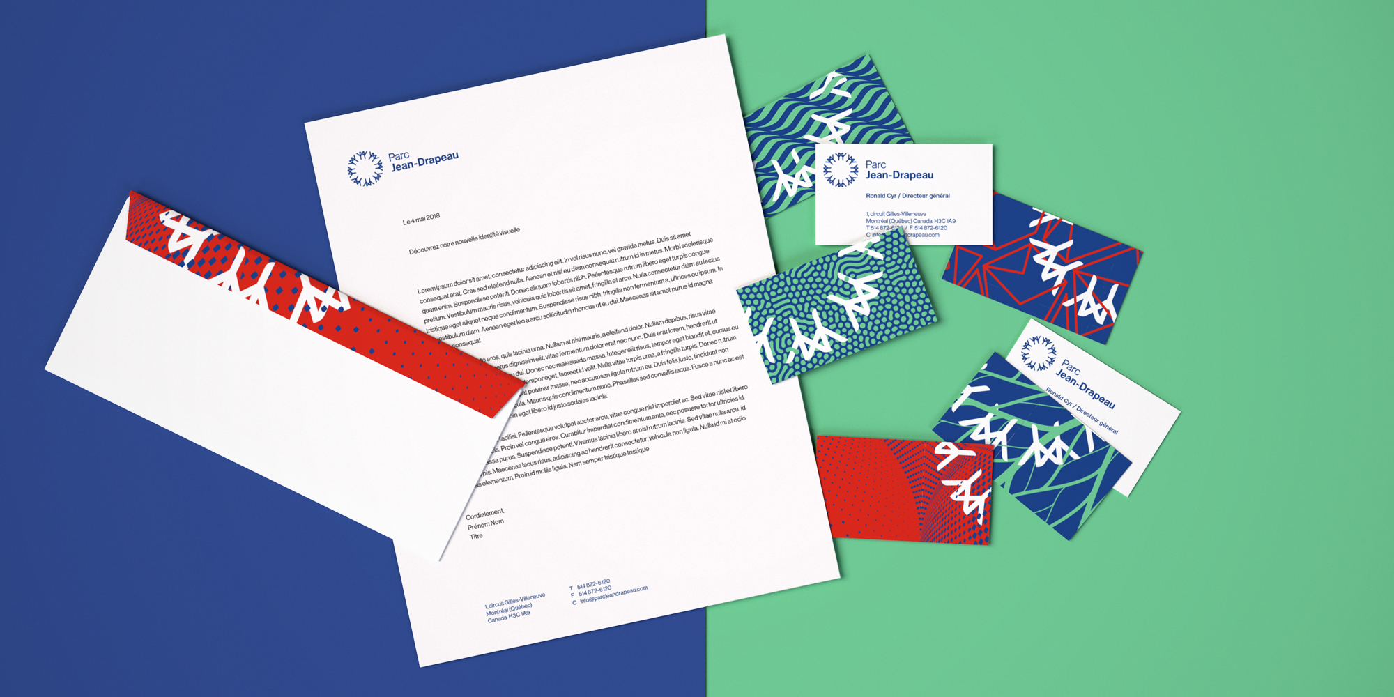


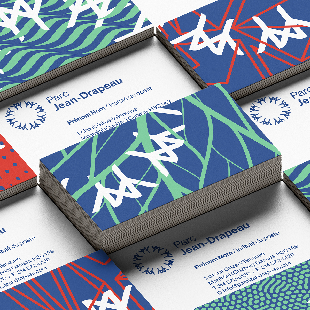

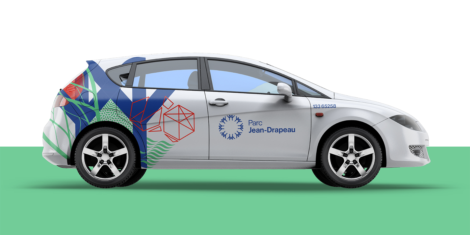


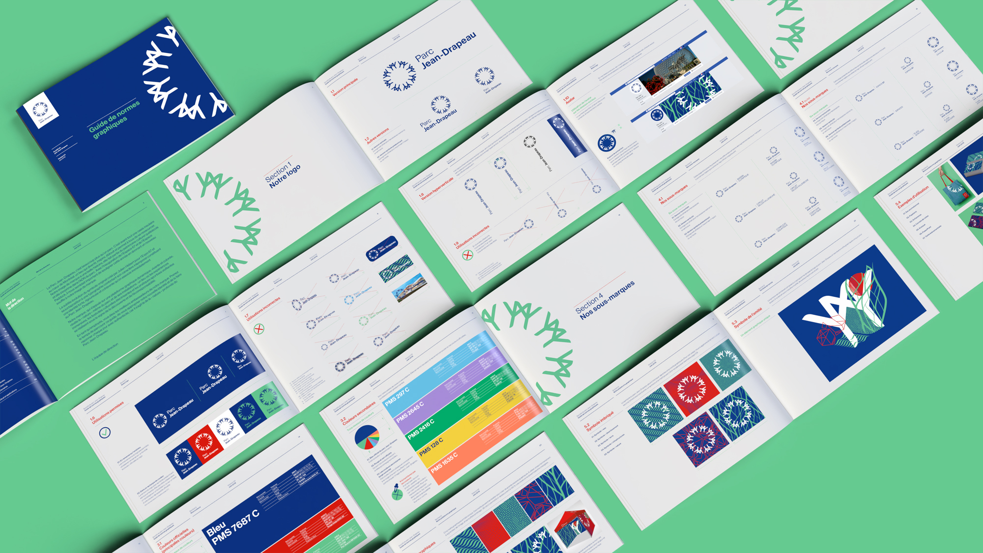

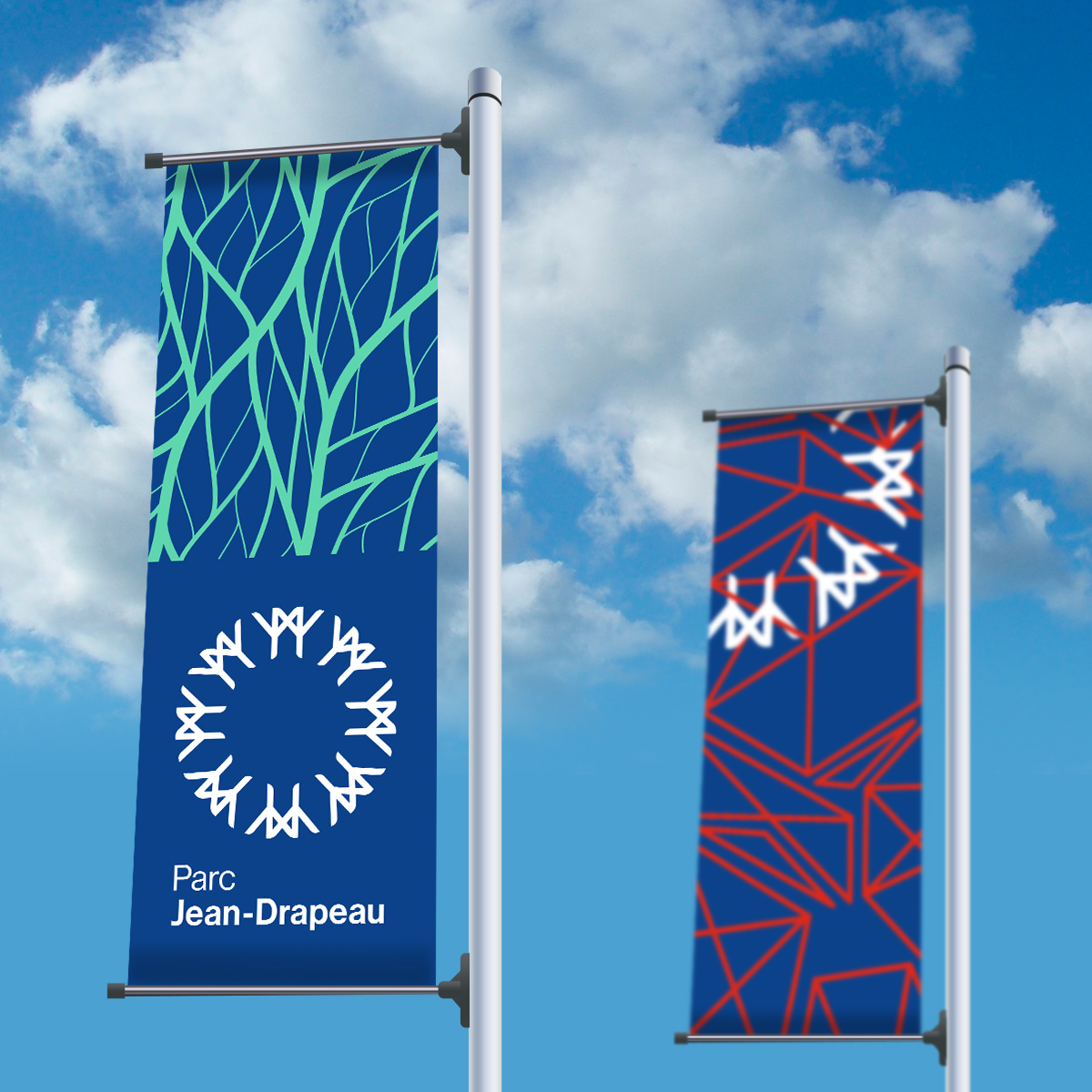
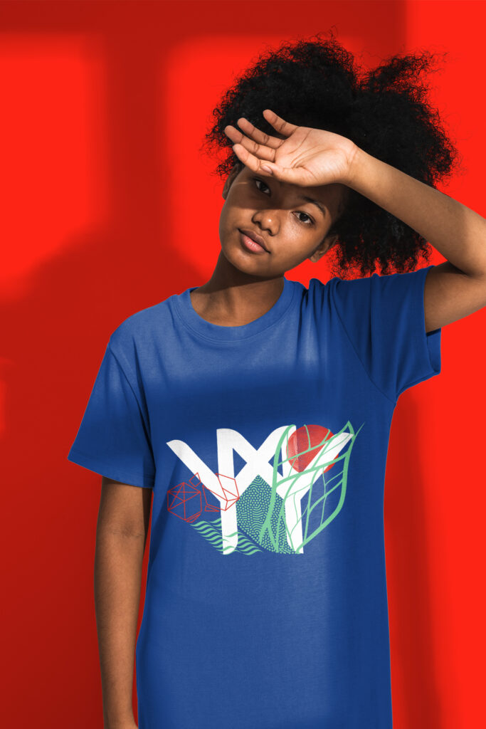
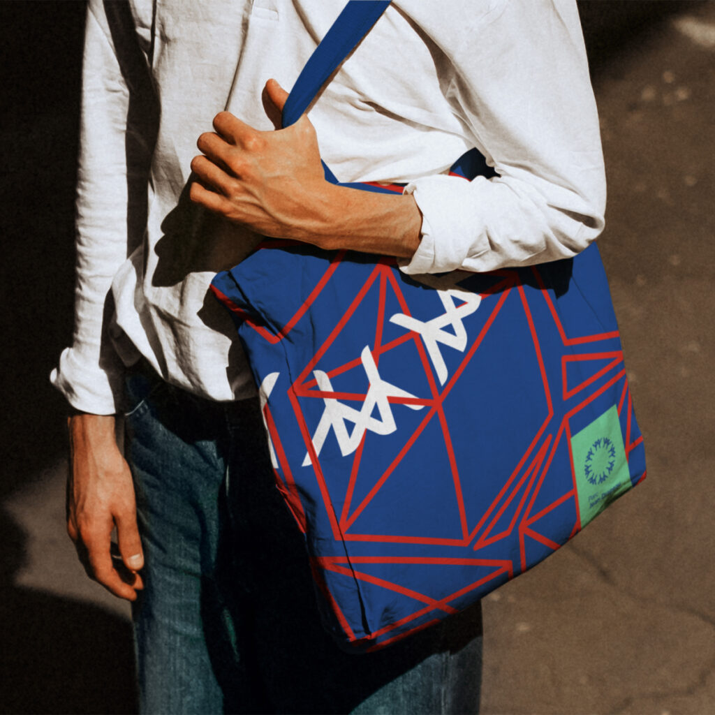
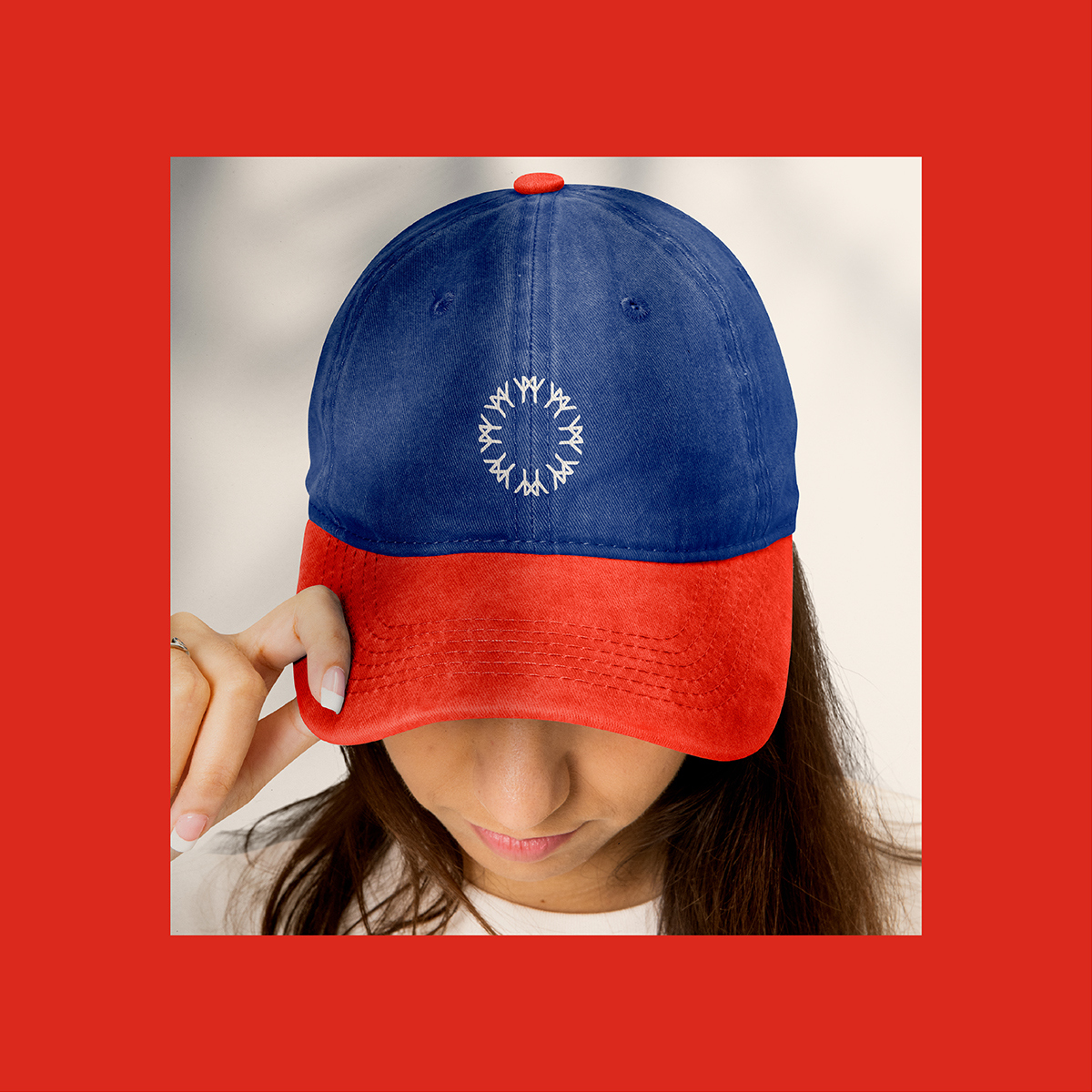
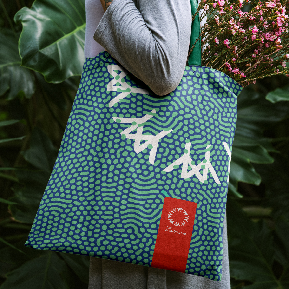
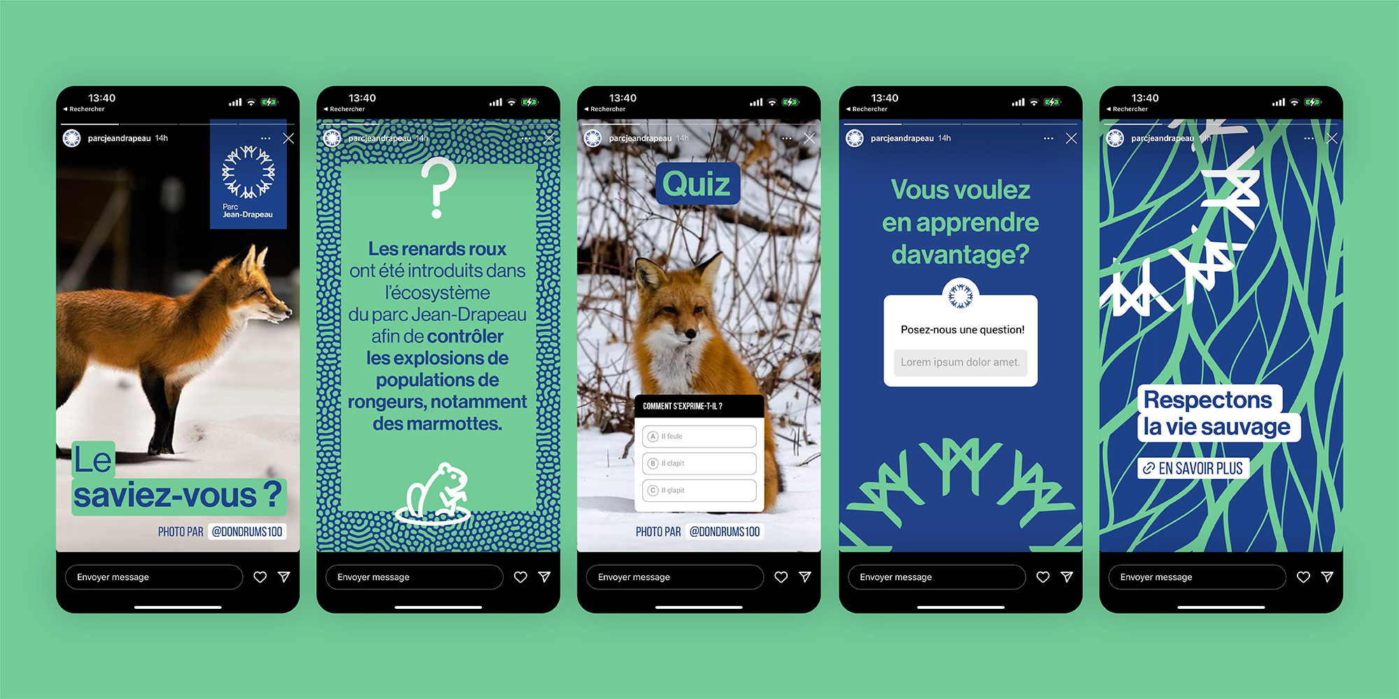
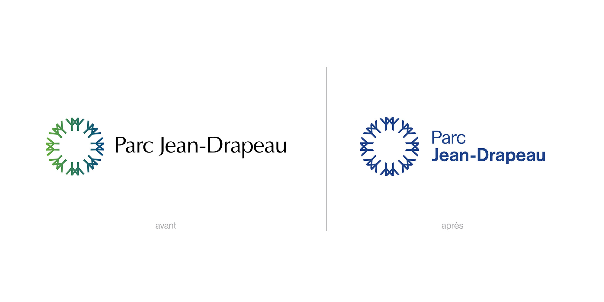
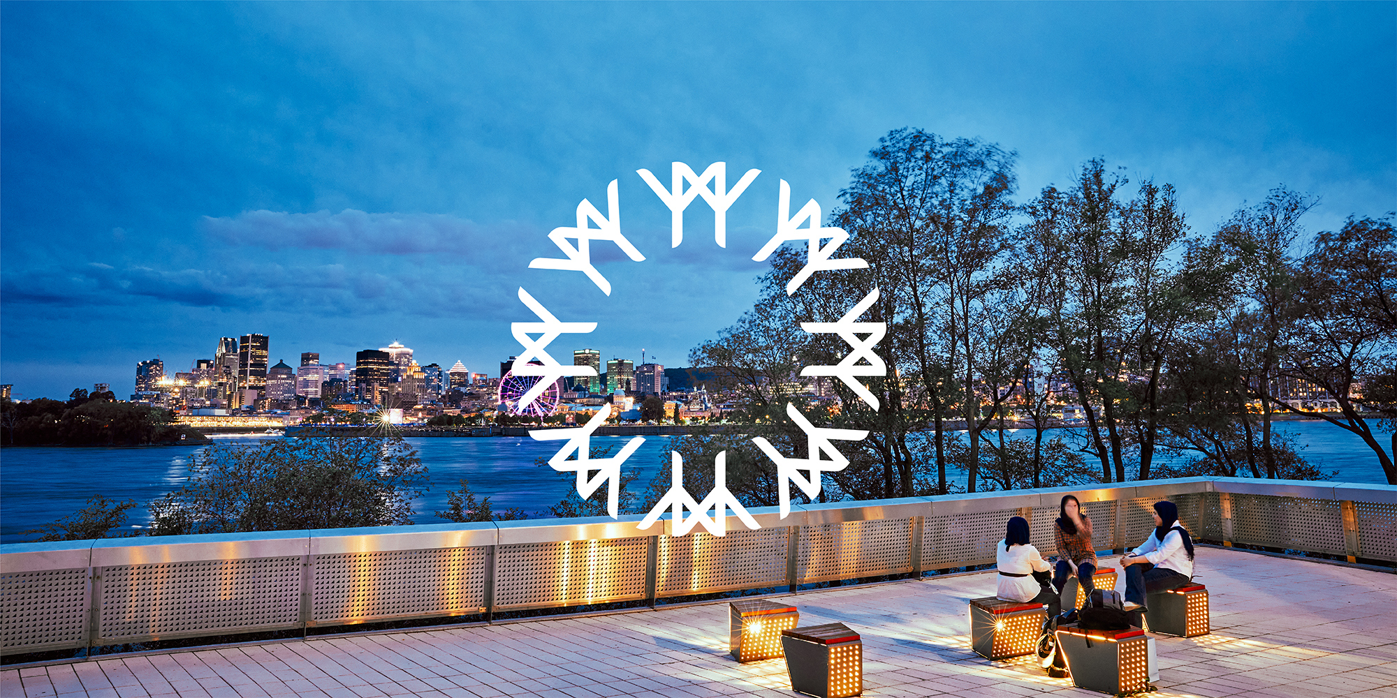
The new logo is an attractive, stylized evolution of Julien Hébert's original creation, while the Helvetica-inspired typography reinforces the notion of timelessness. Together, the colours and the new graphic platform reveal the essence of Parc Jean-Drapeau and its offer, which plays out in four distinct areas: relaxation and nature, entertainment and culture, sports and outdoor activities, and rental facilities. Cleverly, a single element from the symbol itself was isolated to create a graphic illustration of friendship.